The overview of your portfolio just got a whole lot more visual
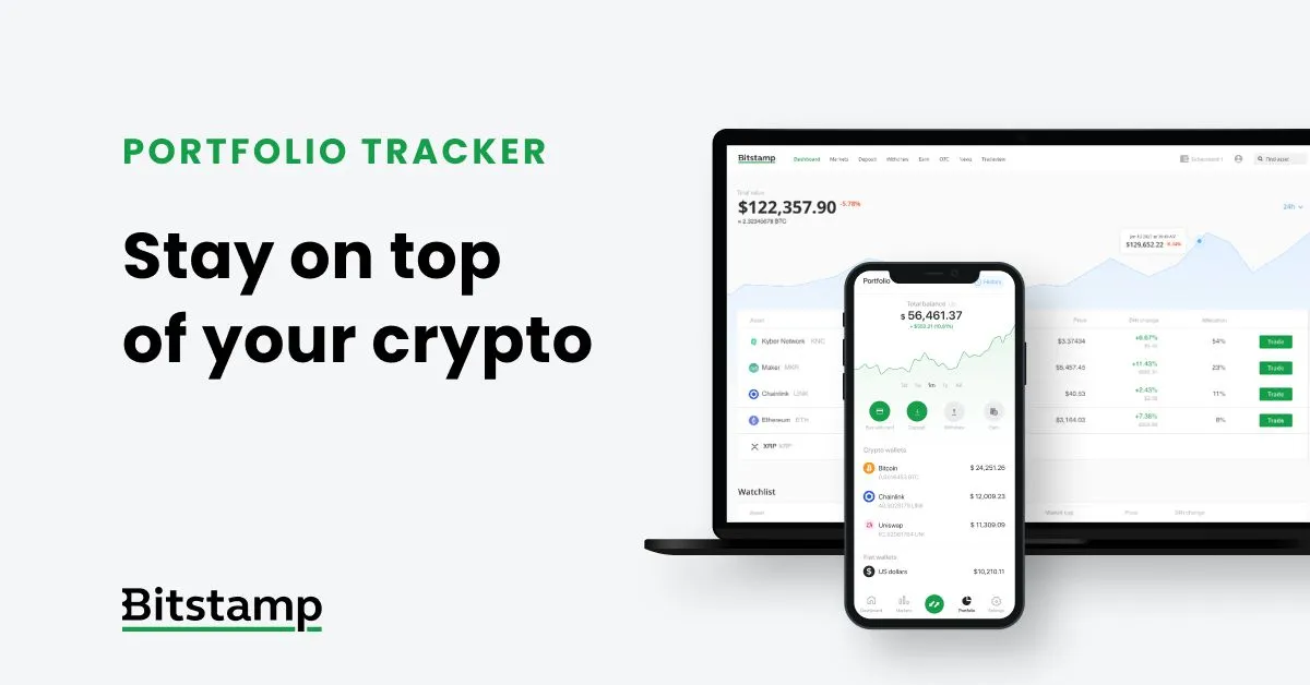
Good news for all you visual types out there! If you’ve logged in to your Bitstamp account recently, you’ve probably noticed a lovely visual representation of your portfolio’s fluctuations. Hopefully, it’s a line going steadily upward.
The run chart of your portfolio changes is the latest feature we’ve enabled in the dashboard of your account and in the portfolio tab of the Bitstamp app. It’s completely interactive, meaning you can change the desired time period of the portfolio’s display (changes in the last day, week, month, year or all together). In the website version, if you hover your mouse cursor over the line, it’ll display your portfolio’s total value in the given moment and the gains or losses based on your chosen time period. Want to know how much you’ve earned in a month or a week? Just select a different time frame, then hover over the line.
It looks cool, it gives you a better understanding of your crypto endeavors, and you can try and draw some pretty mountains if you’re really that good at investing.
Haven’t tried out our app yet? Just click below and install.
- Apple App Store for iOS
- Google Play Store for Android
This webpage has been approved as a financial promotion by Bitstamp UK Limited which is registered with the UK’s Financial Conduct Authority. Please read the Risk Warning Statement before investing. Cryptoassets and cryptoasset services are not regulated by the Financial Conduct Authority. You are unlikely to be protected if something goes wrong. Your investment may go down as well as up. You may be liable to pay Capital Gains Tax on any profits you earn.